We designed a logo for RWSC to refine their brand identity and reflect the clientele.
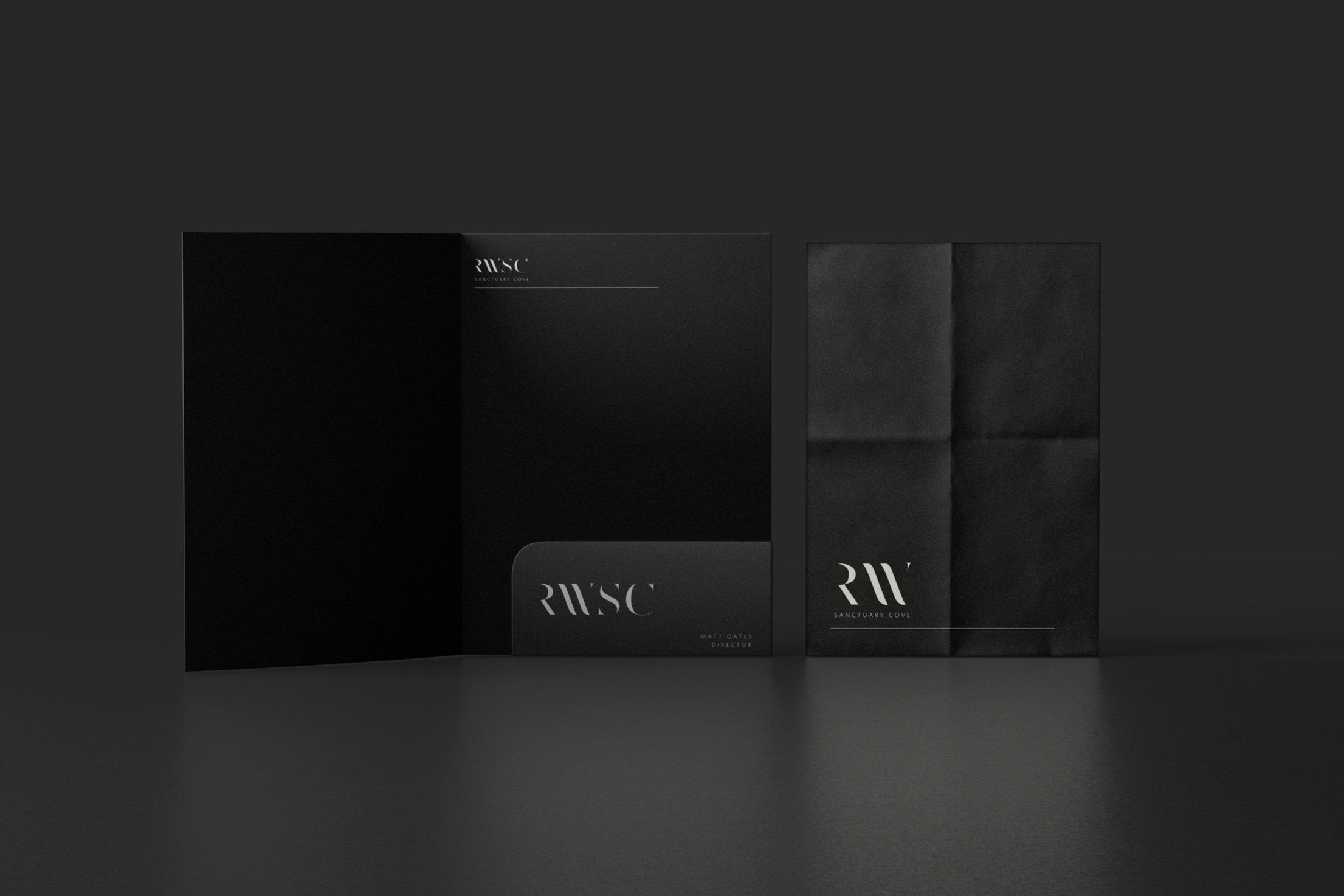
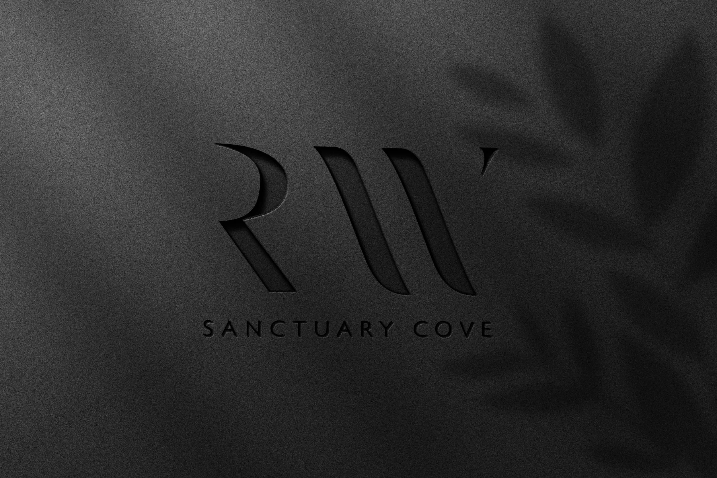
Ray White Sanctuary Cove sought our expertise to craft a distinctive logo that would epitomise their sophisticated and refined identity, to align with their clientele. Our brief was to capture elegance through minimalism, mirroring the essence of high-end luxury brands while maintaining a timeless allure. The logo, designed with a sans-serif font, utilizes the initial letters of the name, employing deliberate removal of sections to adhere to minimalist principles. The result is a logo that is both simplistic and sophisticated.
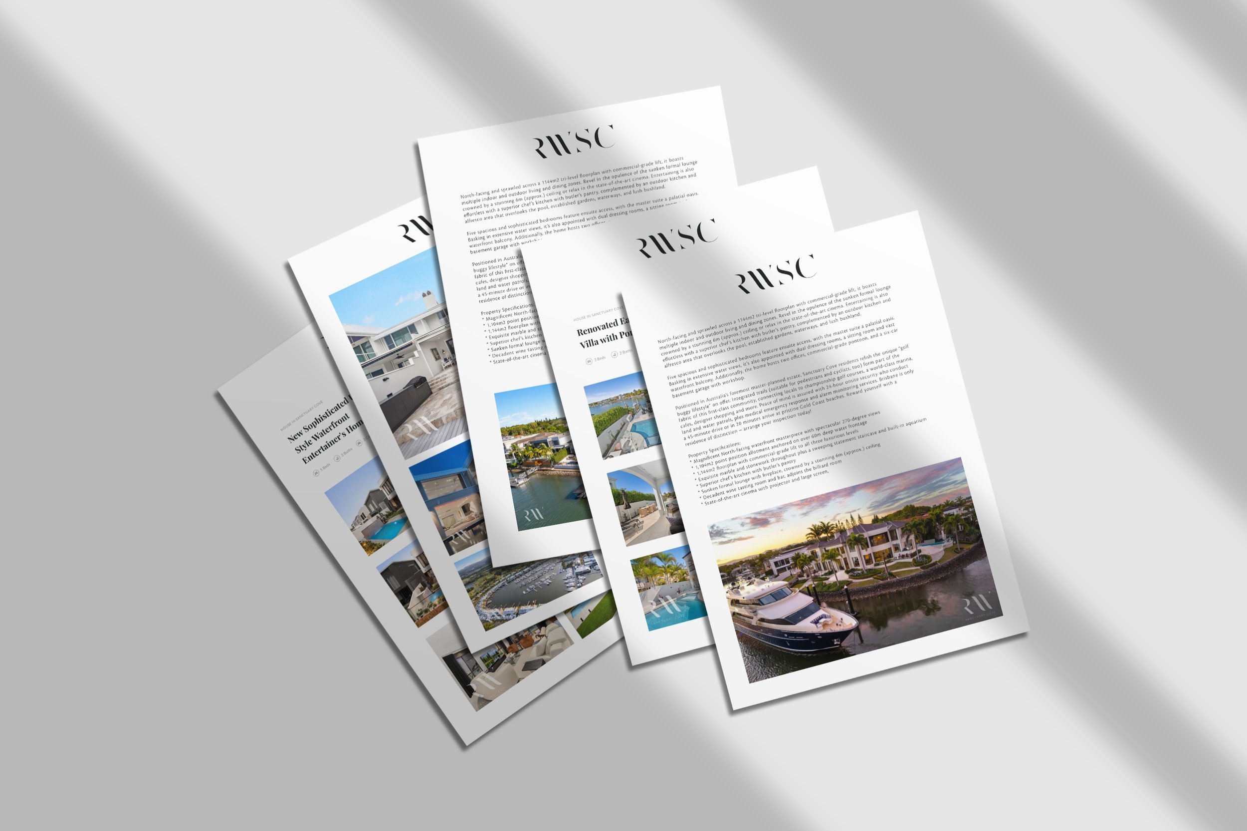
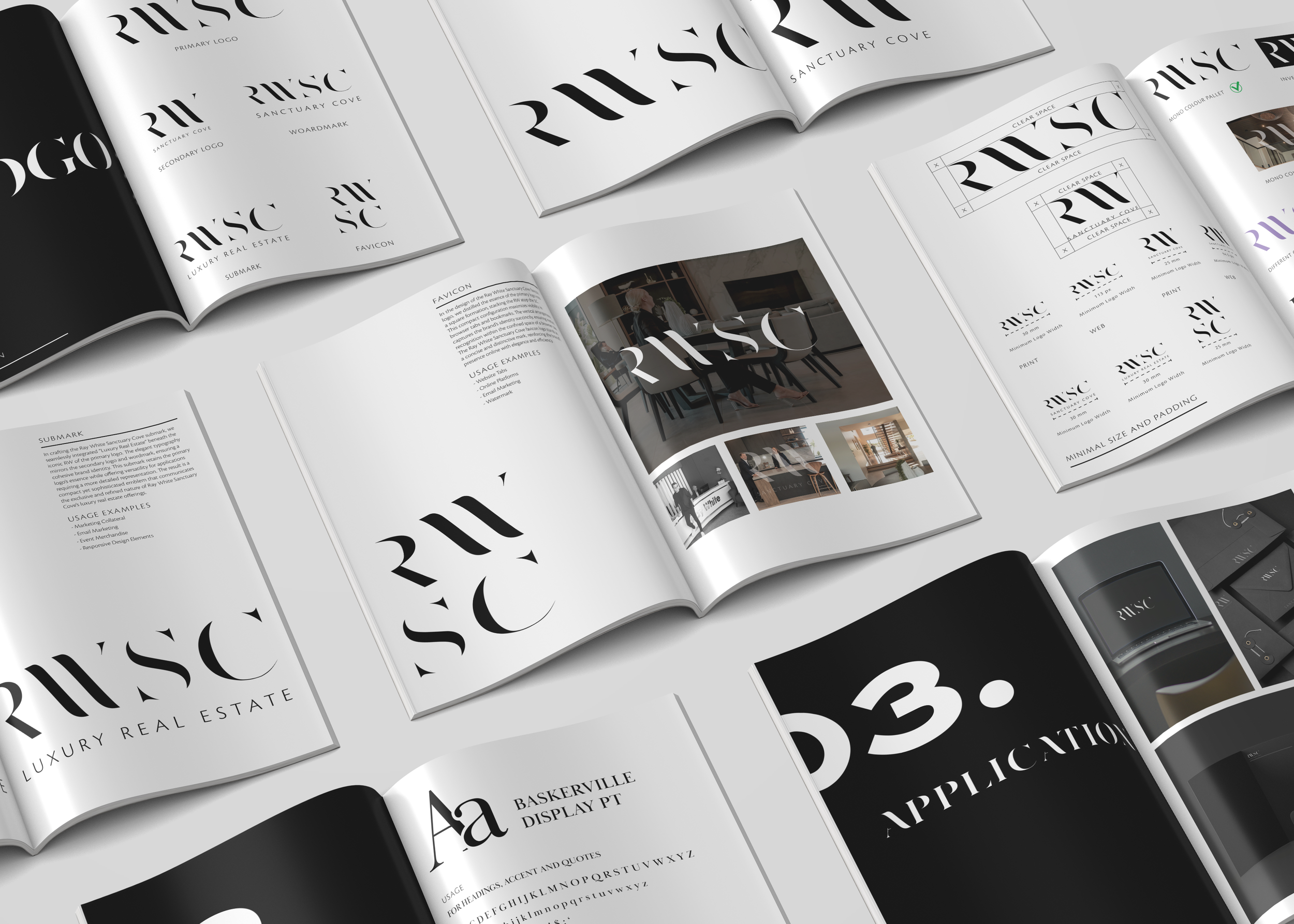
The logo was deliberately designed for versatility, allowing for a seamless application on any brand touchpoint it is and will be applied to. We delivered a comprehensive package including a primary logo, secondary logo, wordmark, favicon, and sub mark, ensuring adaptability across various platforms.
As a comprehensive design agency, our commitment extends beyond logo creation for Ray White Sanctuary Cove; we also provided them with a brand guideline to ensure a consistent brand identity across all touchpoints. Brand guidelines can range from a concise, single-page documents to extensive 100-page manuals, we tailored a minimalist guide specifically for RWSC. This comprehensive document details each logo variation, outlining their respective applications and usage scenarios. Additionally, the brand guideline included typography and application examples across various contexts. Delivering a succinct yet thorough brand guideline, allows Ray White Sanctuary Cove to effortlessly maintain the refined brand they envisioned, and provides them with a valuable tool for creating consistency in their visual communication.